|
|
Post by Fenris on Dec 8, 2008 16:47:20 GMT -5
First of all, an apology: Sorry for taking so long with this guys... Life has been a little hectic and I haven't had the time or energy for TS.
I know some of you have been getting impatient with this, and I can only apologise for being rubbish on my part.
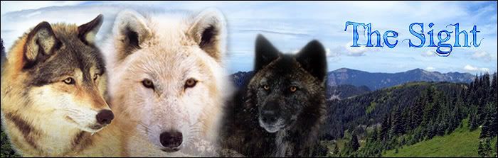
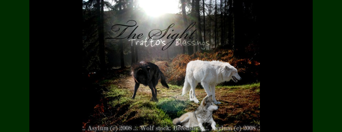
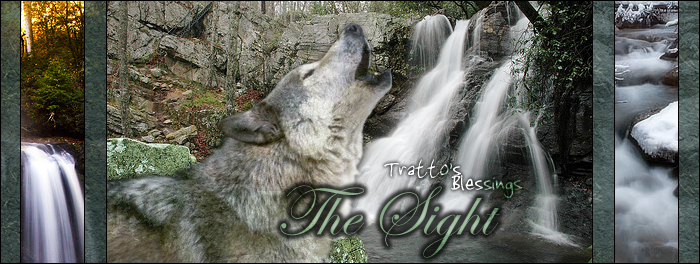
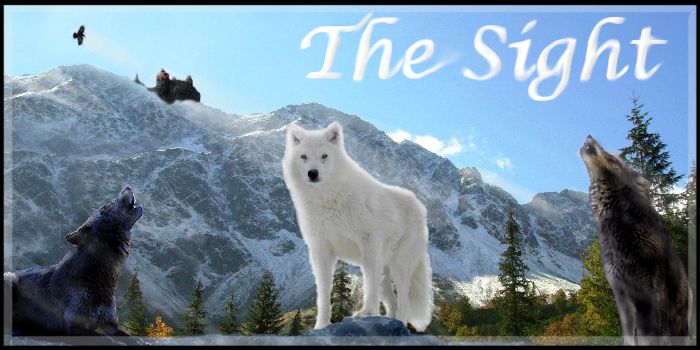
But finally, without futher ado, here are 7 of the entries for the Banner Contest. (Not all of them I know. I wanted to pick the 8 stronger images)
Now, the entries are anonymous so that people aren't all voting for their friend's entries, and please vote for the one you like the best, remember everyone will see it everytime they are on TS, so don't pick something just because it's yours or because you know your friend made it.
(If your entry was PMed to me under the title No Subject or anything like that, I will not have even looked at it, because I can't possibly shift throught 760 PMs in case one happens to have a banner in it. Yell at me if your banner entry was sent under No Subject. (you can check in your outbox))
Banner One
Banner Two
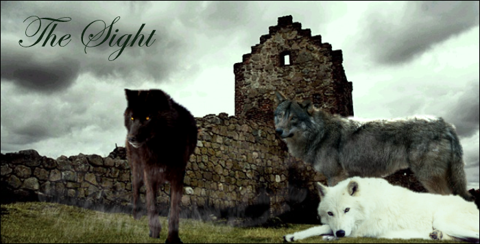
Banner Three

Banner Four
Banner Five

Banner Six
Banner Seven
What? Where Am I?
|
|
|
|
Post by Draeg on Dec 9, 2008 0:37:02 GMT -5
-munches cookie- I vote four.
|
|
|
|
Post by Wolfbane on Dec 9, 2008 2:33:43 GMT -5
I voted threeeee because they pretty much nailed all of the elements of design right on the head. To whoever made it, bloody brilliant job. But if I had a second and third say, it'd go first to six (love the environment changes), then to four. I just hate credits being slapped right on the front rather than meekly mentioned. :x
|
|
|
|
Post by Kai on Dec 9, 2008 12:08:09 GMT -5
I voted for 6. It's crisp and clear, the text is easy to read, and I think it will match the background well. Number 3 didn't seem to match color-wise and 4 is good, just too small and the credits are way too obvious.
|
|
Zynnia
Newborn
 Looking forward to exploring all that the world has to offer.
Posts: 1
|
Post by Zynnia on Dec 9, 2008 15:12:02 GMT -5
Oh, wow, they are all so lovely! I think I'll have to vote for ONE. Really wonderful job, all!
|
|
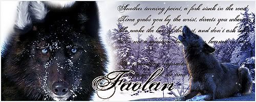
Faolan
Cub
Deorian Scout
It isn't easy having a good time; even smiling makes my face ache.
Posts: 48
|
Post by Faolan on Dec 9, 2008 15:33:44 GMT -5
OOOHHHH! COOOKKKIIEEE!!!!!! otay. i is better. er, i rather like number 6, yes thats definitely my favorite, but second would be 5, and third would be 3. my cookie.
|
|
|
|
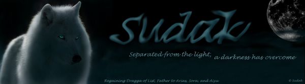
Post by Sudak on Dec 9, 2008 15:37:21 GMT -5
Picked SEVEN, Loved the lighting and how the stone den was put on top of the mountain. Would have picked SIX but I think I would rather it have the big three "larka, fell, and kar" in it.
|
|
Shadowwolf
Sikla
Healer of Koran
.M U S E L E S S
Posts: 105
|
Post by Shadowwolf on Dec 9, 2008 23:26:18 GMT -5
YEA! COOKIE!!!!! ......yea anyways.... I vote for 7! Second i would like 3 and then for third would be 5. I LIKE COOKIES! <3
|
|
|
|
Post by Aiyana on Dec 10, 2008 23:00:30 GMT -5
I picked threeee. Cuz I liked the wolves' poses that they're in, and the letters are freakin' awesome. ^^
|
|
|
|
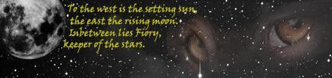
Post by Fiory on Dec 10, 2008 23:08:31 GMT -5
I definately have to side with number 3. It's got to be my favorite. I mean, it looks like it could be a movie cover or something. Or a book cover or a movie poster. It looks amazing in short, and I like it the best. 
|
|
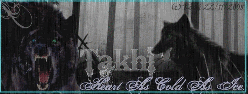
Takhi
Sikla
Nieten of Sarnes
Posts: 154
|
Post by Takhi on Dec 11, 2008 11:49:54 GMT -5
I must say that I love number two and four. The backgrounds in them are awesome!!! They just seem to connect with the story's descriptions of the territories! If I had to pick just one banner...um...I will go with four only because their surroundings seem so natural and fantastic!
Kudos to everyone for their hard work!!! I really love them all! It's a lot better than I can do! Haha!!!!
|
|
|
|
Post by linnaea on Dec 12, 2008 2:20:05 GMT -5
I voted five because it wasn't too busy and it wasn't too boring. I think it'll fit well with the site's background and it has lovely composition.
|
|
Falonis
Newborn
~RPed by Khaza
Posts: 0
|
Post by Falonis on Dec 13, 2008 12:09:51 GMT -5
I voted for 6 because i love the season changes in the banner. It's neat and tidy and i think it'll go well with the sites layout and colour scheme. ;D
|
|
Styr
Newborn
Maybe It's Not A Star After All...
Posts: 8
|
Post by Styr on Dec 13, 2008 16:22:30 GMT -5
Hmmm... I really like number 3 the best..... But, if there would be a backup vote(s), it would have to be 6, then 7, then 4
=3
But the credits are really obvious on number 4 
Well, can't wait to see which one comes out tops =3
|
|
Tarmalo
Sikla
Warrior-Bum of Koran
Where art thou? In a roastacalous roast, of course.
Posts: 225
|
Post by Tarmalo on Dec 13, 2008 20:36:11 GMT -5
eeeeh.....I like number four the best. number three looks nice but I personally like four.....it doesn't look as "shooped" as the rest. In other words I guess you could say it looks more "natural"
|
|


 = New Message
  = No New Message